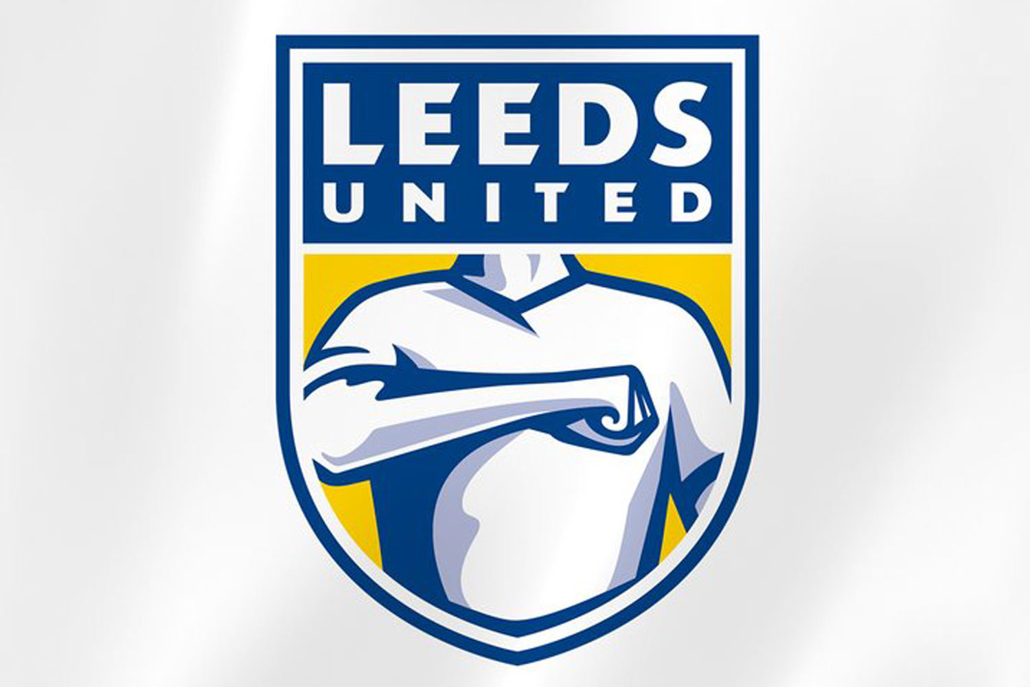
As a celebration of the club’s centenary next year, Leeds United FC have released designs for a new club crest. Depicting a white chest performing the ‘famous Leeds Salute’ (don’t worry, you’re not the only person who’s never heard of it), the design was announced by the club’s official twitter page, accompanied by the soundbite: “6 months of research. 10,000 people consulted. Ready for the next 100 years.”
Perhaps LUFC should have been ready for the next five hours instead, an uncomfortable period of universally hostile backlash which saw over 50,000 angry fans sign a petition to scrap the proposal. The proposed crest is a shambles, a tragic example of PR self-indulgence at the expense of actual fan interaction. Somehow, those higher up in the hierarchy didn’t think that changing the club’s infamous logo into something that half resembles a botched Pro-Evolution Soccer badge, and half resembles a frontline EDL banner, would go down in any direction other than flames.
Changing crests is nothing new. In fact, it has become quite a trend for football clubs in recent years, as more and more clubs seek to transform themselves into profitable, global brands. But these clubs rarely make the mistake of deviating so much from the old that they lose their traditional values and image. The relatively new crest of Manchester City, for instance, is an ode to a logo from a long-forgotten era, and even the incompetent heads at West Ham could foresee the error in getting rid of the iconic hammers from the club’s badge.
So, for a club who’s only redeemable factor has been, for many years, its history, the decision to replace the fabled white rose and the wasp-like shield with a cartoon image that looks like it was developed in a think-tank solely made up of three-year olds is beyond baffling. The future logo claims to be “representing fans at the heart of our identity”, but is devoid of any identity itself. Whereas the current logo remains synonymous with pride and victory through endeavour (words which, admittedly, haven’t been heard around Elland Road for quite a while), the proposed crest suggests nothing other than averageness, miscommunication, and failure at best.
The truth is that LUFC have slowly been regaining a little bit of the integrity that was lost during their administration and the controversial ownership of Massimo Cellino. Pushing for a play-off position this year, LUFC’s valid improvements on the pitch are being undermined again by bizarre decisions off the pitch.
After the overwhelmingly negative backlash, LUFC are rethinking the proposal, and are looking to extend the consultation project. The only reasonable outcome seems obvious. But who knows, they’ve made some poor decisions in the past, so don’t be surprised if this one sticks as well.
Robert Cairns