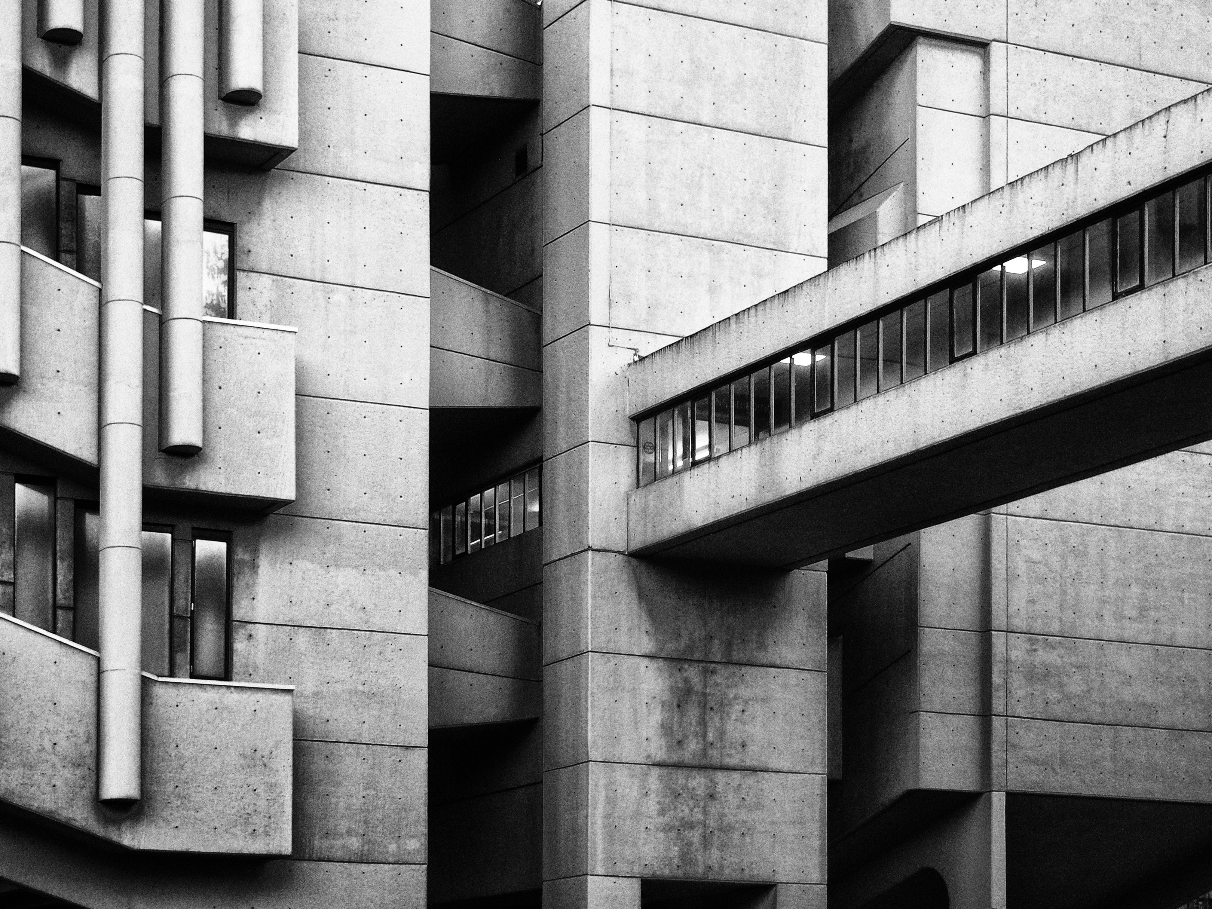
Everybody remembers their first time in the Roger Stevens building. Somehow, I had escaped meeting this mega-monument on my open day to Leeds, so it wasn’t until the timetabling gods allotted me the elusive “Roger Stevens LT 13” in Fresher’s Week that I naively walked into the shadow of the bulky behemoth. Indeed, the shadow it casts is long, both physically and metaphorically. Everybody at the University of Leeds – nay, Leeds – has an opinion on the Roger Stevens building and whether it is beautiful or a sin against good taste. Even its bland name doesn’t exactly inspire poets to pen a love sonnet to it. Yet, here I am, writing to defend its honour, and argue that it is deserving of a place in your hearts.
Designed by Barbican architects Chamberlin, Powell and Bon and completed in 1970, the Roger Stevens building follows the style of the popular post-war Modernist movement, specifically, Brutalism. That sentence may be as dry as Roger Steven’s bare concrete – but bear with me. Brutalism combines sharp angles with a rigid geometric style, resulting in monolithic creations that have thus created extremely polarising opinions. As such, many Brutalist buildings have in recent years been demolished, with critics claiming that their imposing, drab architectural style invite antisocial behaviour on high-rise tower blocks, or that they’re simply an eyesore on the urban landscape.
Modernist without being modern, the Roger Stevens building represents the future promised in the 1950s and 1960s in poured concrete form. Just looking at its organ pipe-clad façade and tiny windows conjures up images of nuclear-powered cars and colonies on Mars. Its space-age, dystopian architecture reflects the utilitarian values echoed in society at the time. It’s a relic of a bygone-era when beige turtlenecks were the height of fashion and the Bee Gees were on Top of the Pops. In a country which is being increasingly populated with identical cell-like student accommodation and bug-eyed glass skyscrapers, the Roger Stevens building stands out amongst a sea of clones. Beauty isn’t just about being aesthetically pleasing; it should be memorable, creating an emotional response. By this interpretation, the Roger Stevens stands head and shoulders above the rest.
Of course, Roger Stevens is not without its flaws. The claustrophobic lecture theatres? Outdated. The weirdly-spaced staircases? Hazardous. And the floor plan? Unforgiveable.
But whenever I walk through that elevated concrete bridge (you know the one I mean) with the setting sun shining through the windows, I can’t help but feel like a budding astronaut walking across that bridge to board their first spaceship.
The Roger Stevens building is more than just its Brutalist exterior: it’s the café with its tea and toast deal that’s saved me numerous times from the brink of essay-induced breakdown, it’s the weirdly-placed pond where adorable ducks teach their offspring how to swim every year, and it’s bore witness to me and my friends staggering through campus late at night on the way into town more times than I care to admit. You can keep your Great Hall and your Clothworker’s Building, Roger Stevens is the one for me.
Image Credit: Phil Openshaw

