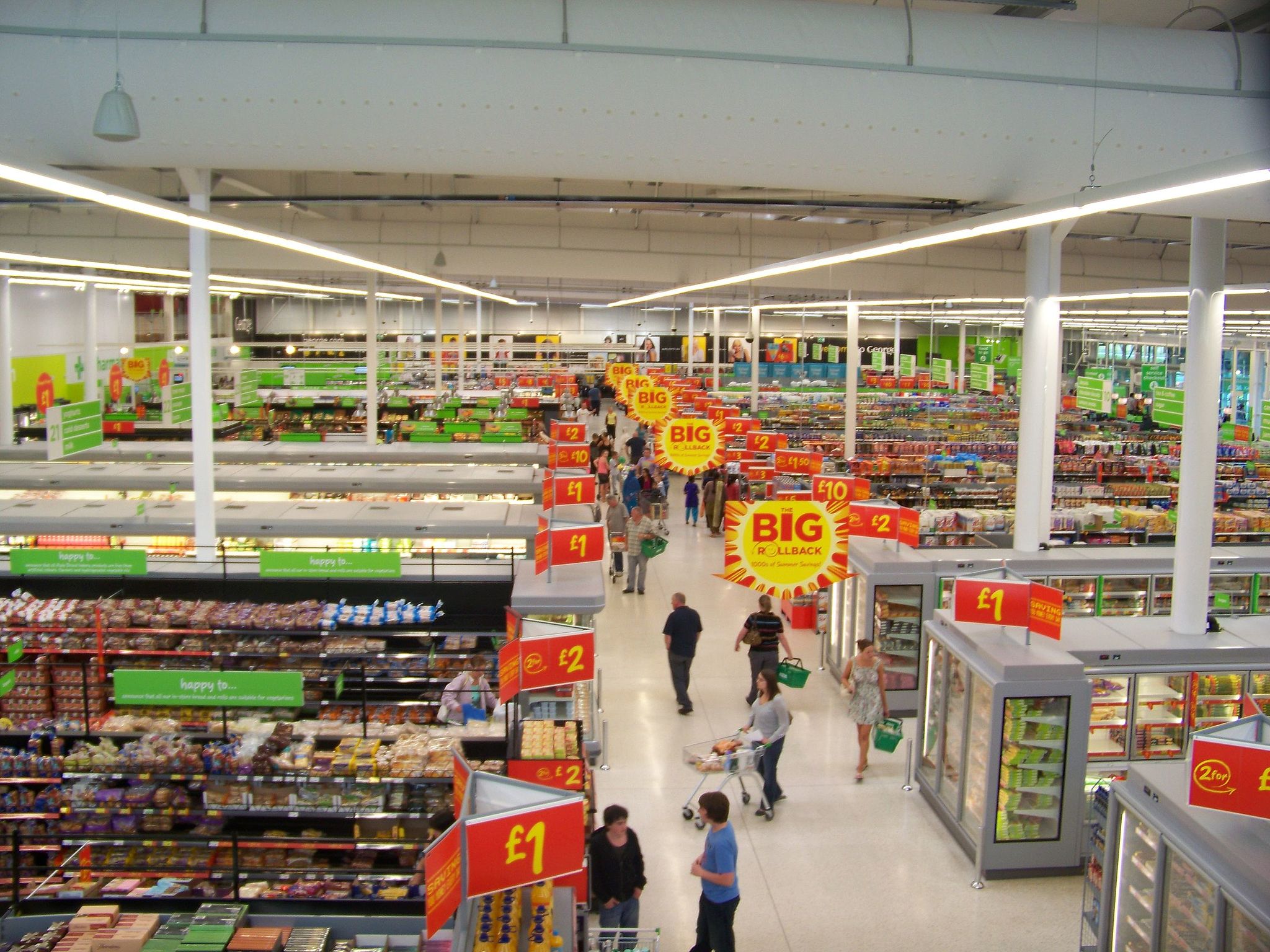
You may have never given it a thought, but supermarkets spend an extensive amount of time planning the layout of their stores. It’s no accident that we find ourselves wandering around, trying to find the one item that we came in for and which seems to have moved around magically. This is more than just sneaky tactics; we’re talking persuasive psychological techniques used by supermarkets to make us spend more.
Supermarkets rely on your subconscious mind to make split-second decisions. Emotions are a big part of this; emotions that can be affected by smell, sound and sight. Entering a supermarket, you may have noticed that fresh produce and fresh bread is positioned near the entrance of the store. The smell of freshly baked bread and the sight of fresh fruit and vegetables promotes good feelings, giving the impression that the store is a refreshing and relaxing place.
The placement of items on the stores shelves has also been extensively studied. Products that the supermarket wants us to buy, for example those with wider profit margins, are placed at eye level. Research – using eye tracking devices – has shown that our eyes mainly focus on these eye-level items. Cheaper products and less popular items are placed higher up on shelves, or instead right at the bottom; places that cause more hassle to reach. Those devious store planners also target children, ensuring that the aisles with the most kid-appealing products are designed so the most tempting items are at the eye level of the child rather than the parent.
Psychological research has also shown that the more time spent inside a supermarket results in us buying more. Placing essential items, such as milk, bread and eggs, apart from one another at the back of the store is done to achieve exactly that – make us buy more! While we try to find our way to the back of the store to get our milk, we pass many red pricing signs that scream “look at me”. Studies have shown that the colour red draws our attention easily, so effectively in fact that a constant distraction from these signs can result in us totally forgetting our shopping list. This prompts impulse buys. We make a lot of these at the checkout, where supermarkets conveniently place smaller items – such as chewing gum – in the hope that buyers will grab them while they wait.
Supermarket research shows that most people will only walk a few steps into an aisle, rather than the arduous task of striding up and down. As a result, the most attractive products, such as branded or sale items, are placed at the ends of the aisles to increase visibility. There’s another psychological trick that supermarkets like to use at this point; they will price items as if they are on sale by putting up a new price sign when, in fact, the item costs the exact amount of money as it did before. Sneaky. Multi-buys are similar in that regards; they look as if it is cheaper to buy in bulk when they will often cost the same, if not more, than if bought separately.
The psychological tricks don’t stop there either; supermarkets even apply them to the trolleys we use. Their size have increased over the past few years, deliberately to play with our perception – to our subconscious mind an empty looking trolley doesn’t look as appealing as one that is filled. Some trolleys have GPS trackers attached to them, tracking your shopping and walking pattern while in the store. In addition to this ‘big brother’ styled shopping experience, supermarkets also use different floor textures – almost like speed bumps – to slow us down and spend more time looking at shelves.
Most importantly though – especially if you’re working to a budget – make sure you avoid shopping when hungry or stressed. Your brain, and stomach, can cloud your judgement! Major resources go into analysing our shopping habits, with many more techniques and tactics existing for supermarkets to make us spend more money. Who’d have thought that so much physiological emphasis could be placed on buying a quick pint of milk…
(Image courtesy of Mtaylor848)

